Acrylic brush – synthetic brushes, the mix of hair is specially made for use with acrylic colour.
Bristle – hog hair. Coarse, strong hair, suited to thick brushwork in oil, alkyd and acrylic painting. Different qualities of hog brushes are available, the most expensive ones carry the most colour and retain their shape best when wet.
Camel – is a pseudonym for a mixture of miscellaneous hairs of low quality.
Goat – makes good mop wash brushes.
Gummed – newly made brushes are pointed with gum in order to protect them in transit.
Interlocked – bristle brushes whose hairs curve inward towards the centre of the brush.
Kolinsky – the highest quality sable hair.
Ox – ear hair is used for flat wash brushes.
Polyester – Synthetic hair is made of polyester; different diameter filaments, varying tapers, different colours and different coatings result in as many possible variations in synthetic brushes as in those made from natural hair.
Pony – is a low cost cylindrical hair, ie. lacking a point, often used for childrens’ brushes.
Quill – bird quills were originally used for ferrules prior to the development of seamless metal ferrules. Still used in some squirrel brushes.
Sable – produces the best soft hair brushes, particularly for water colour. The conical shape and scaled surface of each hair provide a brush with an unrivalled point, responsiveness and colour carrying capacity. There are different qualities, the finest being taper-dressed Kolinsky [Winsor & Newton Series 7].
Squirrel – hair makes good mop brushes but does not hold its belly or point well.
Information provided by Winsor & Newton
These are two whites with very different characteristics, both of which are useful for the artist, depending on their current needs.
Titanium White is the more common of the whites used for painting. It’s known for being bright white, almost bluish, and has excellent opacity and high tinting strength. When mixed with another color, it rapidly lightens the color. The drawback of Titanium White is it can be over-bearing at times, especially when you are just looking to lighten the value a bit and not greatly change the color it’s mixed with.
Zinc White is very transparent, and has 1/10th the tinting strength of Titanium White. The pigment itself is highly translucent, and compliments other transparent pigments, such as Quinacridones, Phthalos, and Hansas very well. You have more control when you add Zinc White. When you add it to another color to lighten it, it doesn’t immediately change it to a pastel shade, like Titanium White can. Both are great colors to have on hand, and you should test both with a variety of other colors to see their strengths and weaknesses first hand.
Information provided by Golden Artist Colors
BRUSHES FOR ACRYLIC
Synthetic hair brushes provide a smoother stroke than natural bristle, retain their stiffness, and when used with acrylics and other water based media, clean easily with soap and water. Most synthetic hair brushes are also more durable. When used with acrylics, natural bristle brushes tend to lose their stiffness, though natural hair brushes often carry more color. It is a matter of preference: synthetic or natural hair.
BRUSHES FOR OIL
Natural bristle brushes are not all alike. Yes, all hairs come from hogs or boars, but many factors affect the performance of the brush. The stiffest and the most desired bristles come from Chungking and Shanghai in China. The best bristle has long, soft split ends called “flags,” which increase the brush’s color-carrying capacity. Generally speaking, the more flags a brush has, the more color the brush holds. Control is further enhanced when the hairs curve inward and become interlocked. A good interlocked brush will maintain its original shape, help you to control the placement of color, and add textural qualities. Some artists who use acrylics prefer natural bristle, while some oil painters choose synthetic brushes. Again, it is your choice.
Sable is also used for blending and for fine detail in oil color. Unlike bristle, sable does not show brush strokes. Although natural bristle brushes can be used with acrylics, sable is not recommended.
BRUSHES FOR WATERCOLOR
Selecting the right watercolor brush can be both challenging and confusing. Natural hair, synthetics and combinations of the two offer seemingly endless choices. For example, sable hair is often recommended for watercolor painting. However, there are many different grades of sable. Even within the finest grade of sable, Kolinsky, there are variations in hair quality. In synthetics, two brushes can have the same hair color, but that may be where the similarities end. Inexpensive synthetic brushes often use a single diameter filament while better quality brushes are a blend of filament sizes. Multi-diameter filaments hold more color and are designed to simulate natural hair. Synthetics are often more durable and usually less expensive. The best synthetics and synthetic sable blends are indistinguishable in performance from many natural hair brushes.
DECORATIVE BRUSHES
Decorative artists have very specific needs related to the limitless techniques and mediums they employ in their art making. For that reason, our decorative series come in the broadest range of shapes and hair types.
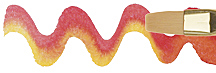
Angle Shader—A versatile brush used to paint both sharply defined edges and contrasting softly shaded areas like foliage.
Bright—Provides better control then flats for details; produces short, crisp paint strokes.
Fan—For blending and softening the edges of other strokes; dry brushing to create hair, trees, shrubbery and grass.
Filbert—For edges and tight areas. Gives a rounded look to a flat stroke.
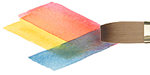
Flat—Broad sweeping strokes for laying in large areas of color like sky or foreground.
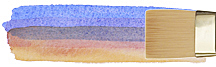
Flat Shader—For blending and large, even strokes. Holds a lot of color. Clean crisp edges.

Grainer—For creating multiple lines- grass, hair and fur.

Liner—Very long hairs create consistent thick to thin lines for tree branches, vines and foliage.
Mop—For covering large areas, softening and blending.
Round—An all purpose brush; for fine detail and outlining; thin to thick lines, calligraphy.
Stroke—Used for lettering, blending and glazing. Long hair length, holds a lot of color, hairs are longer than a shader.
Wash/Glaze—For broad strokes and blending. Apply washes of color or finishes.
Brush Care and Maintenance
Brushes are an investment. If used and cared for properly, your brush will last a long time and perform better. A few basic suggestions:
- Do not immerse the brush in paint up to the ferrule. Wet paint is hard to remove from this area and, if it dries, even more difficult.
- Remove all excess paint with a rag or paper towel.
- Never leave a brush soaking in water or mineral spirits for an extended period of time.
- Never let your brush rest on its head. There are many accessories available that will suspend your brush.
- Watercolor and acrylic paint should be cleaned with mild soap and water. Oil paint should be first cleaned with mineral spirits or turpentine and then with soap and water.
- After cleaning, remove excess water, reshape the hairs into place with you fingers, and stand the brush upright on the handle to dry.
A little effort will protect your brush and save you money.
Information provided by Princeton Brush Company
By its very nature, oil colour is incompatible with water and dissolves only in turpentine, white spirit or low-odour thinners. Artists’ oil colours are made by dispersing pigments in an oil medium to create a smooth, slow-drying paint.
The choice of oil mediums from the wide variety available depends on the surface and the finish required, and the working properties preferred during painting.
OIL DILUENTS
Turpentine
Dilutes oil colour to create thin, quick-drying washes in the early stages of painting. Also used to clean brushes.
Low-Odour Thinners
A low-odour alternative to turpentine, ideal when working in a confined space or for those artists who find turpentine too strong. Also used to clean palettes and brushes.
OIL MEDIUMS
Purified Linseed Oil
Reduces the consistency of oil colour and slows down drying time. In its raw state, it gives colour a high gloss. Diluted 50/50 with turpentine or low-odour thinners, it creates an excellent medium for most types of painting.
Painting Medium
An ideal all-purpose painting medium made of Linseed Stand Oil, White Spirit and Oil of Spike Lavender, which dries to a tough elastic film. Easy to handle, it’s a perfect oil painting medium for beginners, and creates an excellent glaze.
Purified Poppy Oil
A clear oil medium to mix with and reduce light colours. Less inclined to yellow than Linseed Oil, but slower drying. Enhances gloss and flow, but too high a proportion prevents the colour from thorough drying.
Linseed Stand Oil
Reduces the consistency of oil colours and enhances flow. It is viscous and dries slowly to a tough elastic film. Faster drying than pure Linseed Oil. Reduces brush marks.
Alkyd Flow Medium
Slightly thinner than Alkyd Gel, it increases the transparency and flow of oil colour, allowing paint to be brushed out more smoothly. Reduces drying time.
Alkyd White
A quick-drying tube colour, which mixes freely with oil colour. Used like traditional oil colour titanium whites, it is especially useful for underpainting and final highlights in portrait work.
Alkyd Gel Medium
Reduces the drying time of oil colours by up to 50%. Has minimal effect on working consistency of the paint, and produces a very durable glaze.
OIL VARNISHES
Retouching Varnish
This versatile varnish is used to bring back the original paint quality of dry or dull oil. Retouching Varnish is reduced with solvents and is much thinner than final top coat varnishes.
Artists’ Clear Picture Varnish
A removable picture varnish for a clear even gloss, which will not yellow or bloom. May be used on both oil and acrylic painting.
Artists’ Clear Picture Varnish Aerosol CFC free
A removable picture varnish for a clear even gloss, which will not yellow or bloom. When applied lightly by aerosol it makes an excellent Retouching Varnish. May be used on both oil and acrylic painting.
Damar Varnish
A removable picture varnish. Will give a low gloss when applied thinly. Damar dries hard and clear within a few hours. Removable with turpentine or white spirit.
Matt Varnish
A removable varnish that dries to a matt finish. It can be mixed with Artist’s Clear Picture Varnish to give a range of semi-gloss surfaces. It is non-yellowing. Removable with turpentine or white spirit, and can be used to varnish oils or acrylics.
Water Washable Oil Brush Cleaner
Contains natural oils, this solvent-free, low-odour, water-washable cleaner is ideal for cleaning oil brushes.
White Gesso Primer
White Gesso Primer is a unique formulation which needs no dilution. Highly adhesive, it is ideal for directly sealing all semi-absorbent surfaces before applying colours – both acrylics and oils. Suitable for both interior and exterior applications. It dries quickly to produce a matt white surface, with a slight tooth, which is easily sanded for highly detailed work. To tint Gesso Primer use Cryla or System 3 colours.
Black Gesso Primer
Black Gesso Primer has the same characteristics as White Gesso and is applied in the same way. If used as a ground for acrylics one coat is normally sufficient, but up to three coats may be required for oil colour.
Information provided Daler-Rowney
THE SELECTION OF COLORS FOR MIXING
For this palette, the three mixing primaries are Hansa Yellow Medium, Quinacridone Magenta and Phthalo Blue (Green Shade). Our standard recommendation is Quinacridone Red, but we chose Quinacridone Magenta for mixing a broader range of violets and purples.
Naphthol Red Light helps balance the Quinacridone Magenta. Mixtures with Hansa Yellow Medium reveal a wider selection of intense reds and oranges. Mixtures with Phthalo Blue (Green Shade) allow deep reds and maroons.
Phthalo Green (Blue Shade) assists Phthalo Blue (Green Shade). Mixtures with Hansa Yellow Medium produce a great range of greens, particularly subtle yellow greens. This green also helps create a diverse range of earthtones.
Yellow Ochre, a natural earth color, helps “warm” the color mixtures and subdue the brightest colors.
Titanium White is an opaque white for mixing pastel tones. Zinc White is an extremely transparent white for subtle tinting and glazing.
COLOR WHEEL AND THE ADDITIVE PRIMARIES
The color wheel provides structure to the discussion of color and gives a reference point that allows us to draw useful conclusions about how colors interact. We start with Blue, Red and Green. In the natural world, these colors exist along the electromagnetic spectrum in a straight line, but we gain great insights into color mixing by plotting these primaries on an equilateral triangle. We also plot the subtractive primaries, Cyan, Magenta and Yellow.
Natural white light contains all colors. When light hits a surface, its energy is absorbed, reflected or bent. A surface painted Black absorbs almost all the light energy that hits the surface. A surface painted White reflects all the light energy back from the surface. A surface painted Yellow absorbs Blue and reflects the Red and Green within the white light. Colors absorb certain wavelengths of energy and reflect other light energies.
Unfortunately, pigments are not perfect primaries. They do not create a perfect Blue, Red or Green. They do not create Magenta, Cyan or Yellow. We only use a color wheel to align colors and we use practical experience to truly understand how they mix with one another.
THE ARTIST’S COLOR WHEEL AND THE MIXING PRIMARIES
Artists are familiar with color wheels showing Red, Yellow and Blue as primaries and Purple, Orange and Green as the secondaries. Secondaries result from the mixture of two primaries, i.e. Red and Yellow make Orange.
This color wheel shifts colors around dramatically. It usually forces color choices such as Cadmium Red, Cadmium Yellow and Ultramarine Blue, all of which use opaque inorganic pigments. These colors, although beautiful in their own right, severely limit color mixing possibilities. The resulting mixtures show lower values and chromas than mixtures with organic pigments
MIXING COMPLEMENTARY COLORS
We filled the color wheel with our color names so we can use it to develop an understanding of mixing possibilities. Mixing from opposite sides of the color wheel will yield black or gray. This is called mixing complements. For example, we see that Phthalo Green and Naphthol Red Light are almost directly opposite one another. The mixing of these two will yield a simple black. For this reason, the mixing set does not include black.
Adding a color’s complement reduces the chroma of the mixture. For example, mixing a small amount of Phthalo Green into Naphthol Red Light reduces its intensity, however, it also changes the value of the color. To avoid reducing the value of the mixture, use the Neutral Gray of the same value as the color you are trying to mix, or mix a gray from the black produced with your Green and Red mixture with Zinc or Titanium White
MIXING EARTH COLORS
A good deal of painting requires the use of the earth color palette. With high chroma colors, it seems almost impossible to mix colors like Burnt Sienna, Red Oxide or Raw Umber.
Mixing medium greens through lime greens with orange-reds through orange-yellows offers an incredible array of earth colors. When you mix organic pigments, you maintain excellent clarity of color.
MIXING MUTED COLORS
The color blends achievable with the five mixing primaries, plus the two whites, is enormous. Yet, you may need to reduce the intensity of the color for a more subtle quality. Yellow Ochre offers a warming of colors with a subdued glow. Used with Titanium White to tint colors, Yellow Ochre furnishes an opaque alternative to the bright white used to create the pastel range. Used with Zinc White, Yellow Ochre is transparent enough to create a glazing mixture, or deeper warmer tones within the more brilliant colors. Some artists suggest using Yellow Ochre instead of Hansa Yellow Medium to create a different palette of colors.
OTHER PAINT COLOR TERMS
In order to more fully understand how to mix acrylic color we need to define other important attributes of paint color including: Masstone, Undertone and Tinting Strength.
Masstone
The masstone, or body color, is paint applied so it totally covers the surface. No other colors from below show through. For example when Phthalo Blue is thickly applied, the masstone appears black.
Undertone
The undertone of a color is visible when we spread the color very thinly over a white surface. This can be done by scraping the color over a surface or by thinning the colors dramatically with acrylic medium or water. Certain colors, such as the Cadmiums and Cobalts, have similar masstones and undertones. With the transparent organic colors like the Quinacridones or Phthalos, the undertone can be quite different from what might be expected by looking at the masstone. These shifts in hue positions provide some of the incredible richness and magic to working with color.
Undertone is important when using acrylic in a watercolor style, as the brilliance of watercolor comes from the white paper transmitting through the transparent layers of color.
Tinting Strength
The final term we need to define before we explore the practical use of the colors is tinting strength. This is the ability of a color to change the character of another color. We determine this by adding the same amount of Titanium White to each color and observing the resulting strength of the color mixture. Weaker tinting colors create light pastel mixtures. Stronger tinting colors create darker mixtures.
The above information is based on research and testing done by Golden Artist Colors, Inc., and is provided as a basis for understanding the potential uses of the products mentioned. Due to the numerous variables in methods, materials and conditions of producing art, Golden Artist Colors, Inc. cannot be sure the product will be right for you. Therefore, we urge product users to test each application to ensure all individual project requirements are met. While we believe the above information is accurate, WE MAKE NO EXPRESS OR IMPLIED WARRANTIES OF MERCHANTABILITY OR FITNESS FOR A PARTICULAR PURPOSE, and we shall in no event be liable for any damages (indirect, consequential, or otherwise) that may occur as a result of a product application.
THE QUALITIES OF COLORS
To describe color we need to understand three qualities: Hue, Chroma and Value.
Hue is another word for color. It describes the actual color of something. Red, Green and Blue are hues. A cucumber and a lime are both hues of green.
Chroma is also known as a saturation or intensity. It describes how brilliant or subdued the color looks. For example, within the hue of yellow, a lemon has more chroma than a banana.
Value refers to a color’s lightness or darkness as compared to white or black. Yellow is lighter in value, or closer to white, than dark blue. Sometimes it is difficult to determine the value of middle toned colors like orange and green. We easily understand value when we look at the range of Neutral Grays on the Virtual Color Guide. Try squinting while looking at colors to determine their value. Squinting helps the eyes’ black and white receptors make value determinations.
ORGANIC PIGMENTS
Organic pigments are formed from complex carbon chemistry and are synthetically derived in laboratories.
Most organic pigments offer high chroma, high tinting strength and exceptional transparency. A transparent organic pigment, like a small piece of stained glass, allows light to pass through practically undisturbed. This characteristic allows mixtures with relatively high brilliance and clarity. Our mixing set includes five colors made from organic pigments: Hansa Yellow Medium, Quinacridone Magenta, Phthalo Blue (Green Shade), Phthalo Green (Blue Shade) and Naphthol Red Light.
INORGANIC PIGMENTS
Inorganic pigments are not based on carbon chemistry, but instead are derived from natural minerals or ores. These materials are oxides, sulfides, or various slats of metallic elements. Examples include iron oxide, cadmium sulfides and titanium dioxides.
Most inorganic pigments offer relatively low chroma, low tinting strength and a moderate to high degree of opacity. (Zinc is the exception.) Using inorganics for blending color yields mixtures with low chroma, but excellent opacity. Our mixing set includes three colors made from inorganic pigments: Titanium White, Zinc White and Yellow Ochre.
VARNISHING WATERCOLORS with GOLDEN PRODUCTS
CAUTION:The varnishing of watercolor paintings is a non-reversible addition to the artwork that will permanently change both the nature and appearance of the piece. Understanding these issues as well as performing application testing is critical before applying any varnish to a watercolor painting.
GENERAL ISSUES
Some artists feel restricted by the conventional practices designed to protect their artwork. The desire for the watercolorist to display their artwork without a glass barrier creates numerous considerations for the artist or collector because of the fugitive and delicate nature of watercolor paint films and the fragility and absorbency of paper. When a watercolor is taken out from behind glass it loses a physical barrier that prevents contact with dust, dirt, smoke, grease, humidity, ultra violet radiation and anything that can exert force upon it. While varnish can protect the piece from many of these conditions it can not shield the watercolor to the extent that a frame and glass can.
- Because papers and other watercolor substrates are highly absorbent, any varnish applied to the surface will soak into it and become a permanent, non-removable addition to the piece. Once varnished, the watercolor can never be returned to its original condition.
- The impregnation of the substrate with varnish could re-categorize the watercolor as a mixed media piece and potentially exclude it from being considered a watercolor by some societies, museums and conservators
Change in Appearance
The addition of varnish to a watercolor painting will;
- Change the appearance, texture and feel of the paper substrate
- Darken colors with the use of a gloss varnish
- Lighten colors with the use of a matte or satin varnish
Since varnishes offer a sheen that is different than that of the original watercolor painting the artist may want to consider photographing the piece prior to applying varnish.
VARNISH APPLICATON
A varnish functions as a tough yet flexible protective film over artwork. It is designed to reduce damage caused by humidity, dust, dirt, smoke, ultra violet radiation, scuffs and scratches. Varnish should ideally be a removable coating that should endure environmental abuses that would otherwise compromise the longevity of artwork. When applied on weakly bound media like watercolor paint films, varnish also has the ability to seal and hold the pigment and binder in place on the paper.
GOLDEN Archival and MSA Varnishes are both mineral spirit based acrylic varnishes that are formulated with UVLS (Ultra Violet Light Stabilizers) which work to reduce the effects of UV radiation. They create tough but flexible films that are suitable for interior as well as exterior applications. While Archival Varnish is available as an aerosol, MSA Varnish needs to be thinned for brush application or used with appropriate spray equipment. The Polymer Varnish is a water based system that also offers UVLS, although is less effective in providing UV protection. There is also a concern in using water based materials over water sensitive media since this can lead to bleeding or streaking, especially when brush applied.
All of these varnishes are available in Gloss, Satin and Matte.
When varnishing watercolor paintings, be aware that although an increased number of coats will result in greater protection against UV radiation, it also reduces the textural quality of the paper and paint.
For complete information on each of the varnishes please see the following Tech Sheets:
Archival Varnish:
http://www.goldenpaints.com/technicalinfo_archvarn
MSA Varnish:
http://www.goldenpaints.com/technicalinfo_msavar
Polymer Varnish:
http://www.goldenpaints.com/technicalinfo_polvar
THREE OPTIONS
There are three options for varnishing watercolors on paper or on GOLDEN’s Absorbent Ground. With any of these options we strongly suggest first testing the application on a sacrificial piece of similar composition in order to rule out any unwanted results or potential problems that may occur. Performing a test prior to application will also increase one’s skill and confidence when varnishing the chosen artwork.
General Varnish Application Guide:
http://www.goldenpaints.com/technicalinfo_varnapp1
1) Direct Application Using Archival Varnish
This option is the easiest and quickest in application but is non-removable.We recommend, using the Archival Varnish whenever possible as it comes in an aerosol and allows the varnish to be applied without touching the fragile watercolor.
We recommend applying no more than 6 coats of the Archival Varnish and always beginning with Gloss in order to retain clarity and finishing the last coat or two with the sheen of your choice; Gloss, Satin or Matte. If you were to apply all the coats in Satin or Matte the result could be a cloudy or dusty look due to a concentration of matting solids.
Archival Varnish:
http://www.goldenpaints.com/technicalinfo_archvarn
This option requires the use of spray equipment as well as an initial application of a non removable isolation coat. The isolation coat will seal absorbent areas and allow a more even varnish application, while also protecting the artwork if the varnish is ever removed. To avoid bleeding or streaking of the watercolors, always spray apply the isolation coat rather than use a brush. The recipe for a spray-able isolation coat is two parts GAC 500 to one part Airbrush Transparent Extender.
Once an isolation coat or two is applied and allowed to fully dry then any of our varnishes may be used. For spray applications, 4-6 coats are recommended, while for brushing we recommend 1-2 coats of the MSA Varnish or 2-3 coats of the Polymer Varnish for best performance.
Archival Varnish:
http://www.goldenpaints.com/technicalinfo_archvarn
MSA Varnish:
http://www.goldenpaints.com/technicalinfo_msavar
Polymer Varnish:
http://www.goldenpaints.com/technicalinfo_polvar
The third option takes advantage of both options 1 and 2 in order to incorporate removability of the varnish without the need for spray equipment beyond the aerosol can. If the watercolor is on paper spraying two even coats of the aerosol Archival Varnish (Gloss) is usually enough to seal and adhere the pigments to the paper. If the watercolor painting is on Absorbent Ground, then three even coats of Archival Varnish (Gloss) are generally required to prevent bleeding or streaking. After these have fully dried, brush apply an isolation coat composed of two parts Soft Gel (Gloss) to one part water. Be careful to mix the isolation coat slowly to avoid foam and bubbles. Once the isolation coat has dried, apply either the Archival (4-6 coats), MSA (1-2 coats) or Polymer Varnish (2-3 coats).
Archival Varnish:
http://www.goldenpaints.com/technicalinfo_archvarn
MSA Varnish:
http://www.goldenpaints.com/technicalinfo_msavar
Polymer Varnish:
http://www.goldenpaints.com/technicalinfo_polvar
Introduction to Varnishing:
http://www.goldenpaints.com/technicalinfo_varnapp
Mark Golden’s blog entry addressing varnishing watercolors:
http://www.goldenpaints.com/blog/2007/plastic-arts/varnishing-watercolors/
Just Paint article addressing testing and protective coatings:
http://www.goldenpaints.com/newsletters/2006/protective-coatings—test-results
DISCLAIMER
The above information is based on research and testing done by Golden Artist Colors, Inc., and is provided as a basis for understanding the potential uses of the products mentioned. Due to the numerous variables in methods, materials and conditions of producing art, Golden Artist Colors, Inc. cannot be sure the product will be right for you. Therefore, we urge product users to test each application to ensure all individual project requirements are met. While we believe the above information is accurate, WE MAKE NO EXPRESS OR IMPLIED WARRANTIES OF MERCHANTABILITY OR FITNESS FOR A PARTICULAR PURPOSE, and we shall in no event be liable for any damages (indirect, consequential, or otherwise) that may occur as a result of a product application.
What is a Ground?
Historically, a ground is a surface specially prepared for painting by applying a layer of paint of even tone in preparation for further painting techniques. Acrylic Gesso can be used as a ground in the true sense, or a layer of gel, medium or paint can also be used for this purpose. With the availability of so many suitable products, a ground can be very specifically tailored for the requirements of the artist.
Acrylic Ground for Pastels
This product is a relatively translucent ground with a granular texture similar to fine sand. It provides enough tooth to simulate a pastel paper’s roughness, and can be used under chalk, crayon, charcoal, graphite and pastel. It can be applied over other acrylic mediums, gesso or colored backgrounds. Its toothy nature is effective for dry-brush painting effects. See the Information Sheet to learn more about Acrylic Ground for Pastels.
Absorbent Ground
Absorbent Ground is a unique product that offers excellent absorbency, allowing artists to mimic stain or watercolor effects previously only obtained by watercolor paper. It can also be used to impart various textured effects by varying the application tool (coarse brush, squeegee, etc.), and can be applied on any surface that can be gessoed, allowing for almost unlimited possibilities. When properly sealed, the work does not need to be displayed behind glass. For a more detailed explanation of the application of Absorbent Ground, refer to its Information Sheet.
Pumice Gels (Fine, Coarse, Extra Coarse)
Pumice Gels can be used to create textured surfaces. They dry to a hard film, yet you can increase their flexibility by mixing them with other Gels and Mediums. The Fine and Coarse Pumice Gels can be useful as grounds for pastels.
Clear Granular Gel
Clear Granular Gel has the same textural quality as its pumice counterparts, but without the gray, opaque grit.
Molding Paste
Excellent for building surfaces and creating textures. Dries to a hard, yet flexible, opaque film.
Light Molding Paste
The density of the wet product is over 50% less than that of regular Molding Paste. This results in a significantly lighter film. This dramatic weight reduction will be beneficial in creating artworks that are large in size, have thick film build-up, or both. The product dries to an opaque, matte finish, and the consistency is designed to hold stiff peaks to create a highly textured surface.
(This information was provided by GOLDEN ARTIST COLORS)
Disclaimer
The above information is based on research and testing done by Golden Artist Colors, Inc., and is provided as a basis for understanding the potential uses of the products mentioned. Due to the numerous variables in methods, materials and conditions of producing art, Golden Artist Colors, Inc. cannot be sure the product will be right for you. Therefore, we urge product users to test each application to ensure all individual project requirements are met. While we believe the above information is accurate, WE MAKE NO EXPRESS OR IMPLIED WARRANTIES OF MERCHANTABILITY OR FITNESS FOR A PARTICULAR PURPOSE, and we shall in no event be liable for any damages (indirect, consequential, or otherwise) that may occur as a result of a product application.